The All-Neutral Trap: Why Playing It Safe With Color Makes You Look Less, Not More, Put-Together
A head-to-toe neutral outfit is supposed to be the pinnacle of grown-up style. Beige trousers, a cream top, a camel blazer. It feels correct. The reality is different. This combination often erases your silhouette entirely. You don’t look polished. You look shapeless and unintentional.
Quick Answer
- Head-to-toe matching neutrals erase your silhouette, creating a shapeless “beige column.”
- A colorful accessory distracts from but doesn’t fix a shapeless neutral outfit.
- Create a contrast boundary between your top and bottom using light vs. dark value.
- Diagnose your outfits by converting a photo to black and white to check for contrast.
- The intentional tone-on-tone exception requires one specific, non-negotiable element to work.
- Use the clash of warm and cool undertones to break up similar-looking neutrals.
If you only do one thing: Convert a full-length photo of your outfit to grayscale to instantly see if it has defining contrast.
The Problem with “Correct” Neutral Dressing
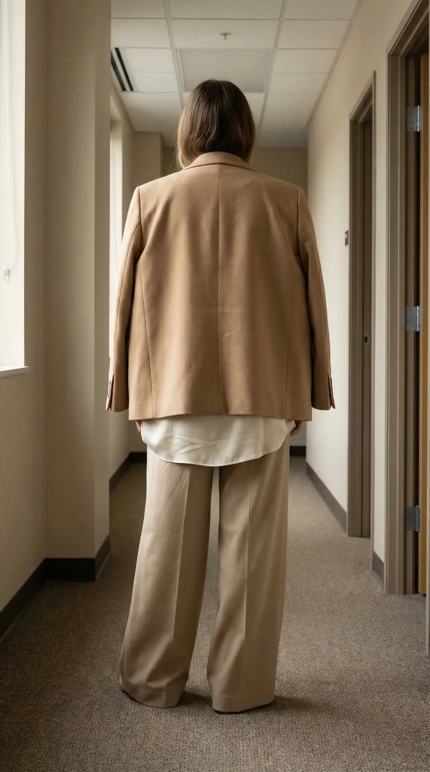
It creates a beige column. That’s the core issue. When you combine technically matching neutrals—beige trousers, a cream top, a camel blazer—you haven’t built an outfit. You’ve built a monolith.
The individual garments disappear. Your carefully chosen high-waisted trousers? Gone. The expensive silk blouse? Invisible. The tailored shoulder of the blazer? Lost. All your investment and thought evaporates because the human eye needs contrast to perceive shape. Without it, you become a single, broad block of sameness.
This sounds obvious, but it took me seeing a photo of myself to understand. I wore what I thought was a perfect tonal outfit. In the picture, I had no waist. My legs seemed to start somewhere under my ribs. The outfit read as low-effort, not sophisticated, because nothing was *defined*. The lack of contrast neutralized every smart proportion I tried to build.
Technically coordinating neutrals like beige, cream, and camel creates a visual “beige column” that dissolves your silhouette. Without a clear contrast boundary, individual garments and proportions disappear, making the outfit read as accidental rather than intentional, regardless of quality or fit.
The trap is believing “neutral” equals “cohesive.” Cohesion without structure is just a blob. Your clothes should work together to show your shape, not hide it in a cloud of adjacent hues.
Why “Add a Pop of Color” is a Failed Solution
It’s a distraction, not a fix. The standard advice for a bland outfit is to add a colorful accessory. A bright bag. Statement earrings. It feels active. But it solves nothing.
The problem is foundational. A colorful accessory draws the eye to itself, away from the shapeless column you’re wearing. It’s a decoy. It doesn’t create the necessary contrast between your core garments—the top and bottom—that defines your proportion. You’re just pointing a flashing light at your hand instead of fixing your silhouette.
Think of it like a poorly structured report with a brightly colored chart. The chart is engaging, but the underlying data is still a mess. The accessory is the chart. Your shapeless outfit is the bad data. I learned this the hard way, fussing with scarves while ignoring the real issue. It’s a cosmetic patch.
This is why advice like the story behind I Wore White resonates. A stark white top can act the same way as a red bag—a high-contrast element that becomes the entire focus, often creating a new problem instead of solving the existing one. The goal is integrated structure, not scattered bright spots.
A colorful accessory only distracts from, rather than solves, a shapeless neutral outfit. It fails because it doesn’t address the core issue: a lack of visible contrast boundary between main garments that defines waist, shoulder, and leg lines, which is essential for a polished silhouette.
The pop of color treats the symptom, not the cause. You need to fix the outfit’s architecture first.
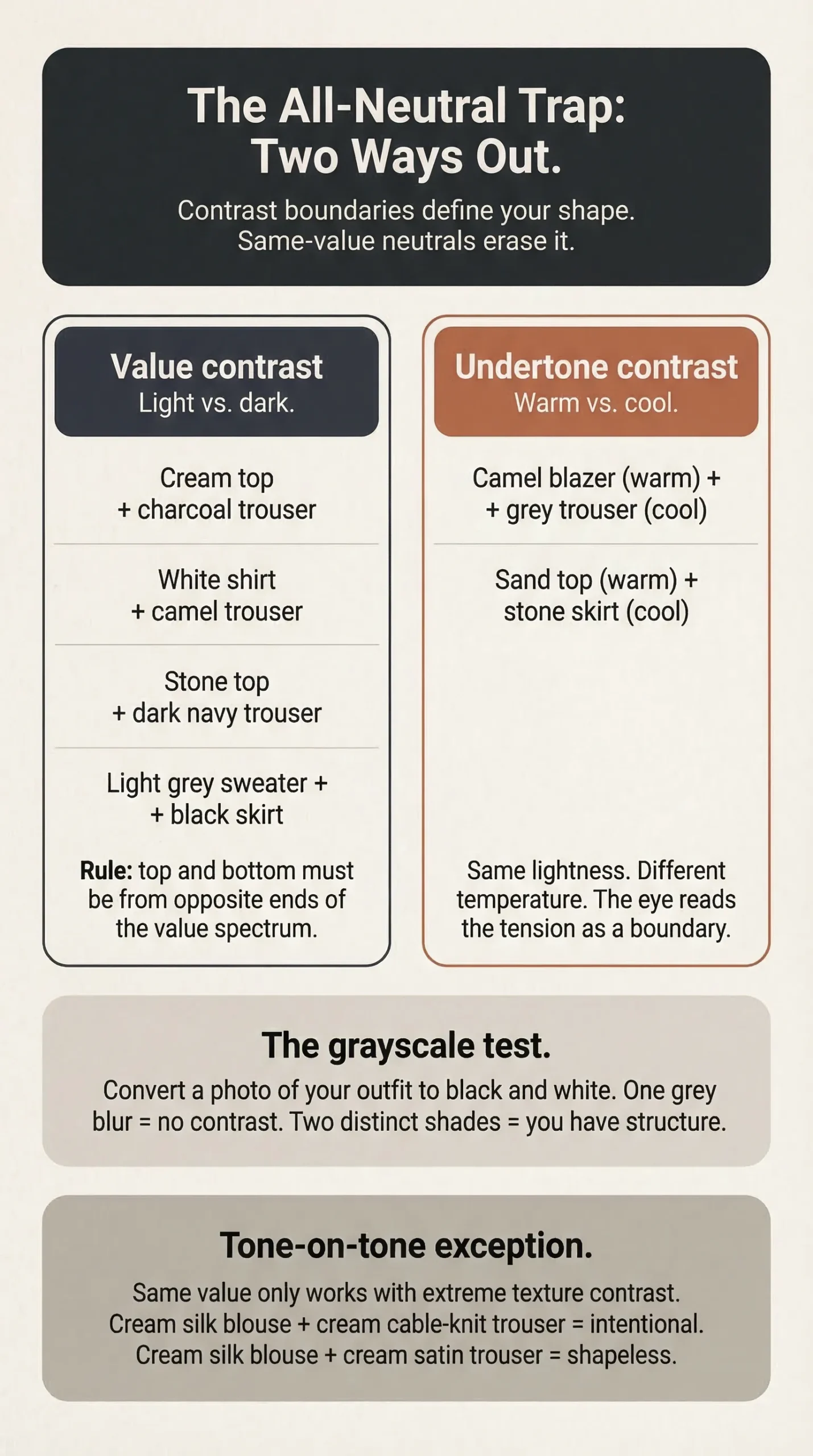
The Framework: Contrast Boundaries Define Your Shape
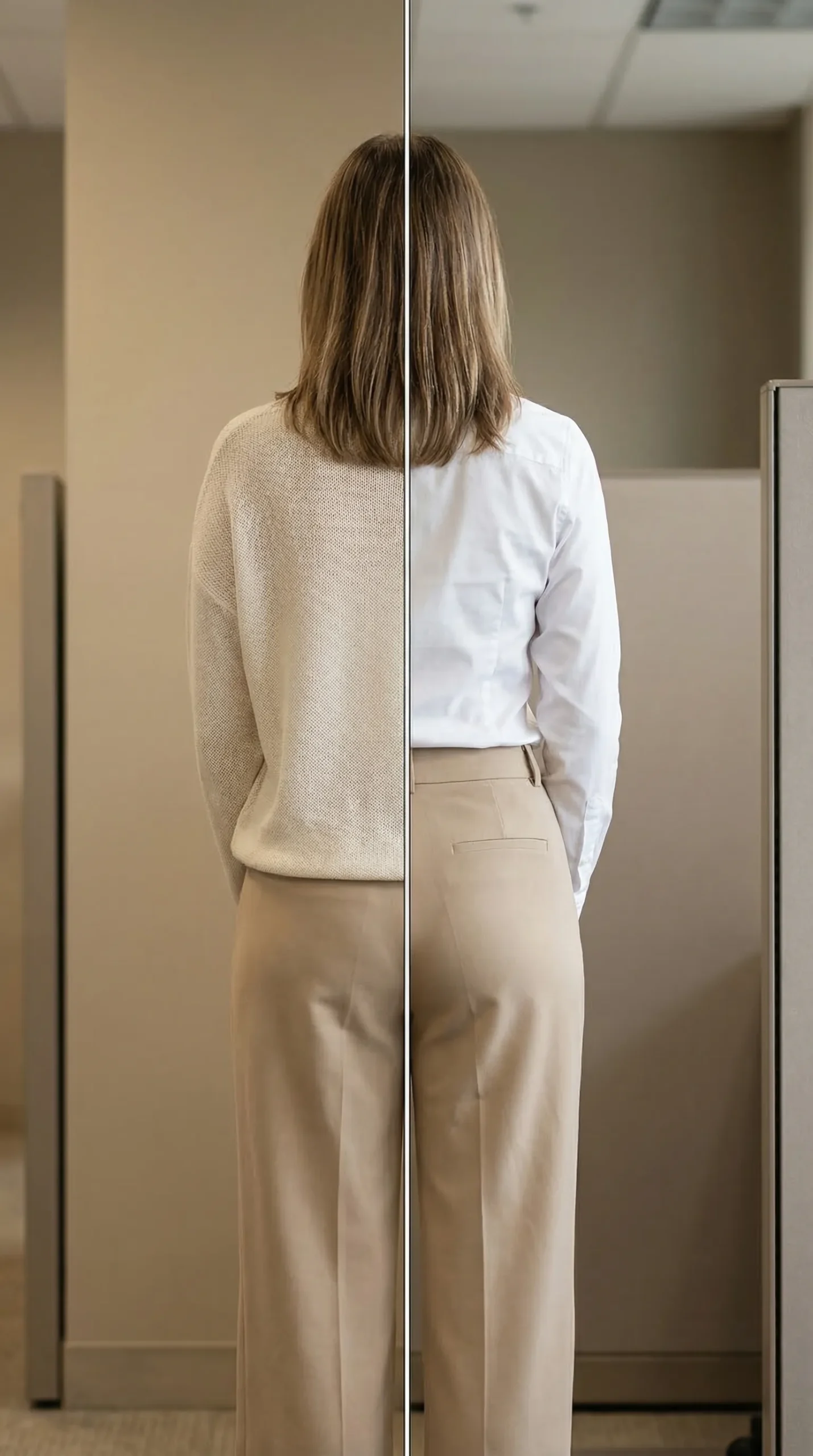
Your silhouette needs landmarks. In dressing, these landmarks are created by contrast boundaries—the line where a lighter piece meets a darker one. This boundary defines your waist, your shoulder line, the length of your leg. No boundary, no visible shape.
Contrast here doesn’t mean neon green. It means value: light vs. dark. A cream shirt against charcoal trousers. A white tee against navy jeans. It can also mean undertone: a warm camel blazer next to cool grey trousers. The eye perceives the difference as a border. That border is what gives an outfit its structure and intention.
This isn’t about being “bold.” It’s about being legible. A well-defined silhouette communicates precision, even in relaxed clothes. It’s the difference between a tailored jacket that clearly sits at your waist and a sack dress that hangs from your shoulders. Both can be neutral. Only one has a clear contrast boundary defining a shape.
The mechanics of this are physical, not magical. As explored in the piece on The Sitting-to-Standing Problem, how fabric interacts with your body’s posture is fundamental. A contrast boundary makes this interaction visible, showing where your body is, even in motion. Without it, the outfit just floats around you.
A polished silhouette requires visible contrast boundaries where lighter and darker pieces meet. This contrast, achieved through value (light/dark) or undertone (warm/cool) differences, creates the visual landmarks that define proportion. It’s a mechanical principle for legibility, not an aesthetic preference for bold color.
The problem, then, isn’t neutrals themselves. It’s *same-value* neutrals worn together. Nuance is everything. You can wear all neutral if you manipulate value and undertone with precision.
The Execution: How to Audit and Fix Your Outfits
Theory is useless without action. You need a system to diagnose and solve the value-contrast problem in your own wardrobe. This isn’t about buying new things. It’s about seeing what you own with new eyes.
The process is methodical. It removes the emotion from “does this look good?” and replaces it with a simple, visual test. I use a version of this every morning. It takes two minutes and prevents those “something is off” feelings by noon. The goal is to move from accidental blending to intentional definition.
A practical tool for this audit is building what I call an Orphan Wardrobe—a documented system of your pieces tiered by versatility and contrast potential. It turns your closet into a solvable puzzle, not a source of stress. You stop staring at clothes and start building outfits with guaranteed structure.
Let’s break it down into steps.
Step 1: The Grayscale Diagnosis
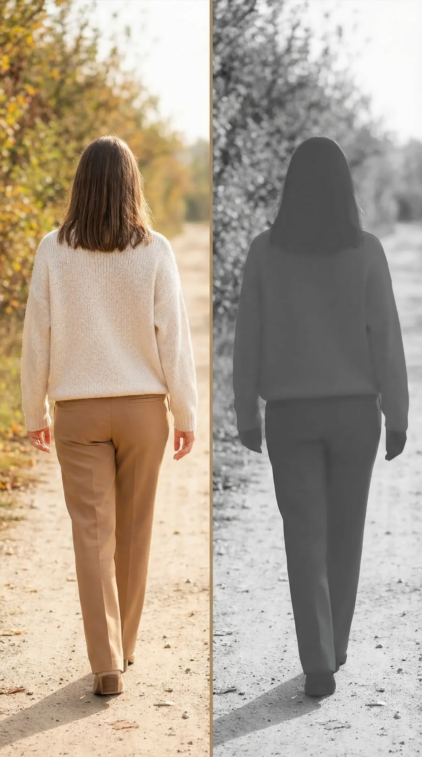
Take a full-length photo of your outfit. Then, use your phone’s photo editor to convert it to black and white. This strips away color and shows you only value.
What do you see?
- One blur of similar grey? This is the problem. Your outfit has no contrast boundaries.
- Two or three distinct shades of grey? This is good. You have definition.
I do this with client wardrobes. We lay out “perfect” tonal outfits and desaturate the photos. Nine times out of ten, the outfit becomes a single grey mass. It’s the fastest way to prove the concept. Your eye is tricked by beautiful colors. Black and white tells the truth.
Step 2: The Easiest Fix – Opposing Values
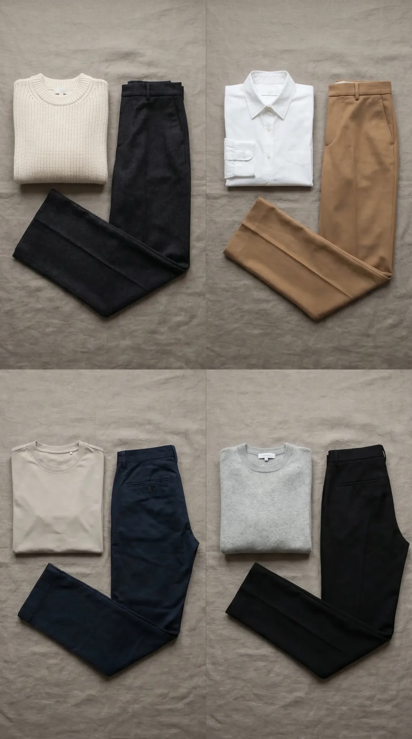
Keep your neutral palette. Just ensure your top and bottom are from opposite ends of the value spectrum. This creates an automatic, foolproof contrast boundary.
Here are concrete combinations:
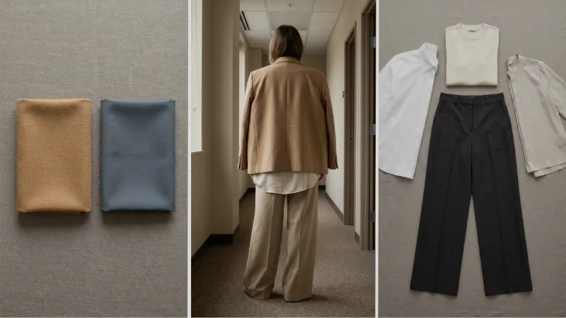
- Cream top + charcoal trouser
- White shirt + camel trouser
- Stone top + dark navy trouser
- Light grey sweater + black skirt
The formula is simple: light top, dark bottom. Or dark top, light bottom. The point is opposition. This doesn’t limit color. It gives structure to color. You can wear all beige if your top is *light* beige and your bottom is *dark* taupe. Value is the key.
Step 3: The Intentional Tone-on-Tone Exception
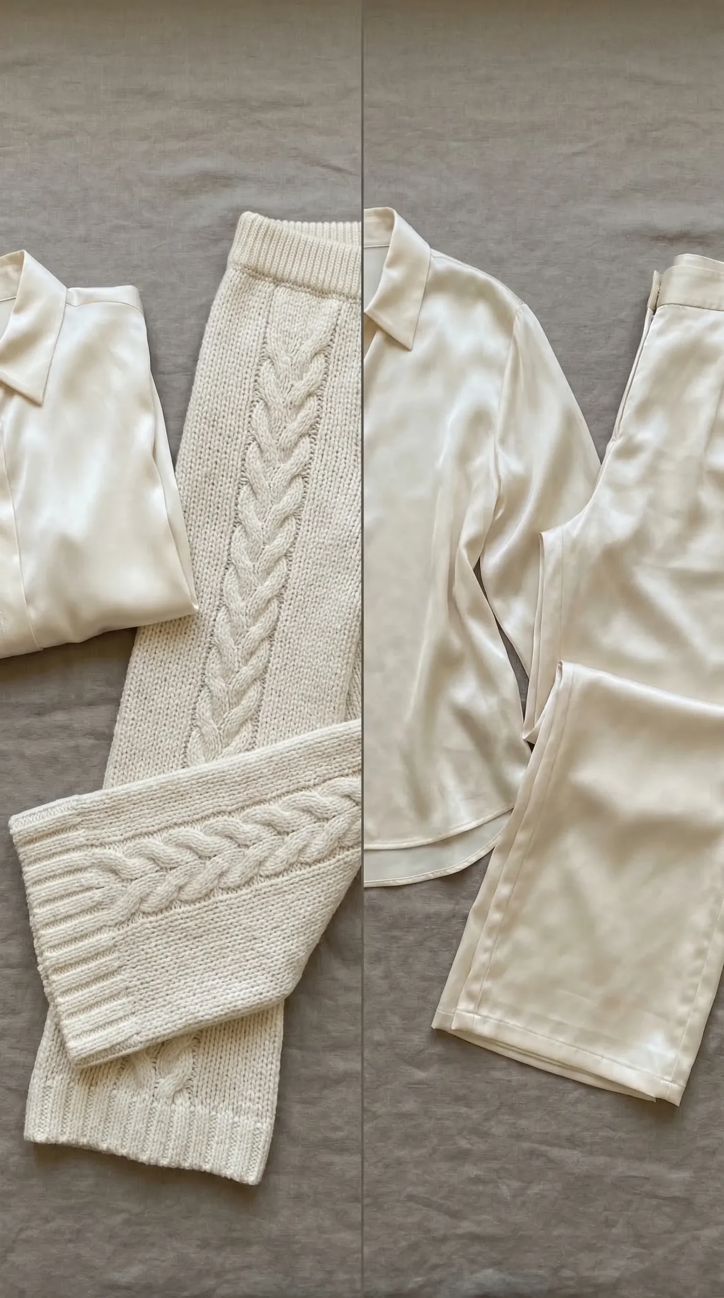
You can wear same-value neutrals successfully. The rule is: replace value contrast with extreme texture contrast.
- Deliberate: A cream silk blouse with cream thick, cable-knit trousers. The smooth, glossy silk versus the heavy, matte wool creates the visual separation. The eye sees “different,” even if the color is identical.
- Accidental: A cream silk blouse with cream satin trousers. Both are smooth, drapey, and similar in sheen. They blend into one another, creating the shapeless column. This is what fails.
Texture contrast is work. It requires thought. But when done right, it reads as deeply intentional and sophisticated. It says you understand the rules well enough to bend them with precision.
Strategic Anchors for Effortless Definition
You don’t want to analyze value contrast every single day. You need anchors—foundational pieces that apply the framework automatically. These are your wardrobe workhorses. Build your outfit around one, and definition is guaranteed.
I use two anchors. One solves 80% of my dressing problems. The other solves the remaining 20% when I want something specific. They require minimal daily thought, which is the point. Style should be systematic, not a daily crisis.
Anchor 01: The Dark Bottom as Your Default Base
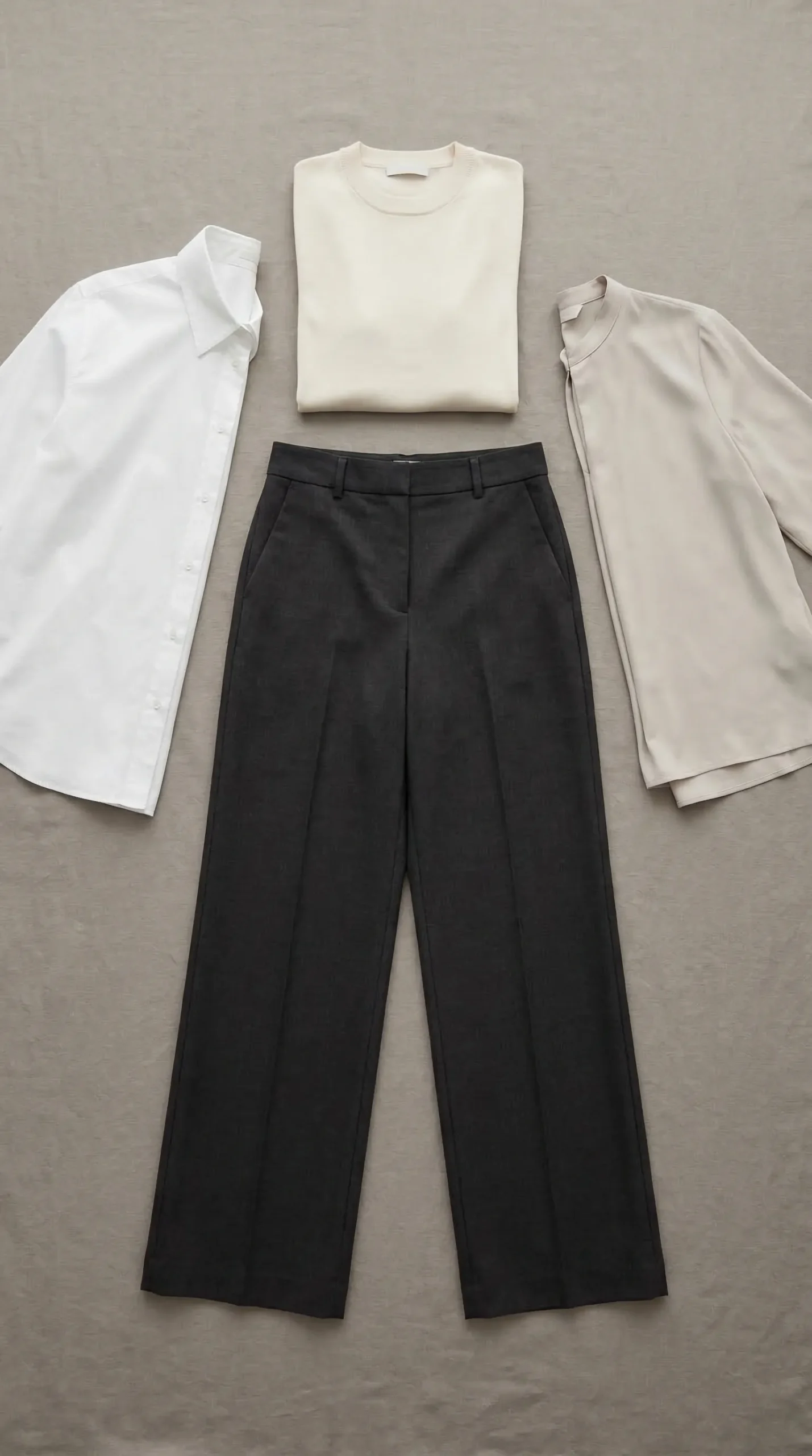
Anchor your bottom half in a dark neutral. Charcoal, dark navy, deep forest, black. Pair any lighter top with it. Instantly, you have a contrast boundary at your waist and hips.
This is my non-negotiable. Almost every work outfit starts with a dark trouser or skirt. A cream top defines my waist against the dark pant. A white shirt looks crisp. Even a mid-tone sweater works because it’s still lighter than the deep bottom. The dark base grounds the outfit and creates a long, clean leg line.
It’s boring until you see the results. Then it’s freedom.
Anchor 02: Undertone Contrast to Break Sameness
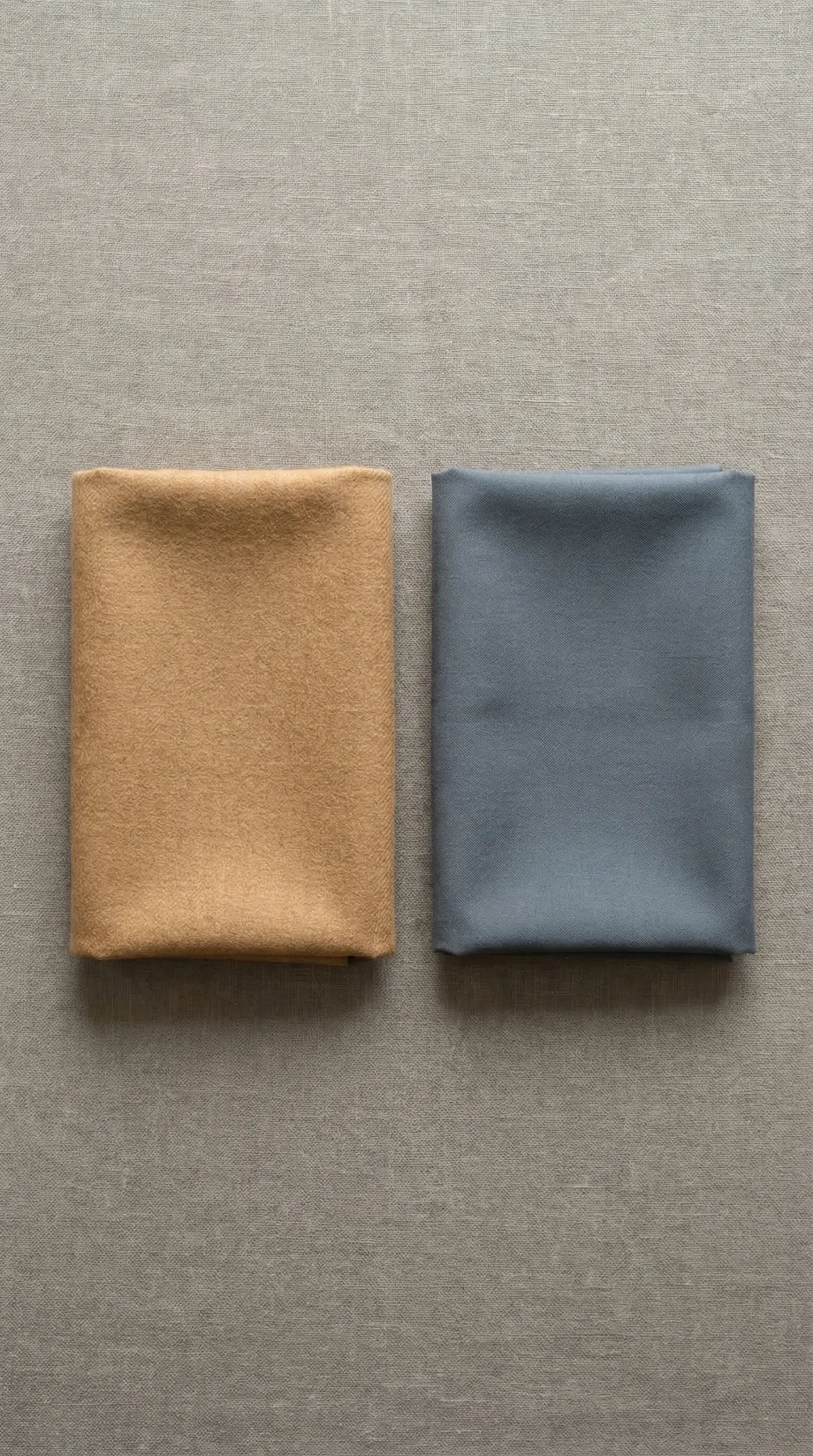
Sometimes you want a light bottom or a same-value suit. Here, use undertone. Pair a warm neutral with a cool one.
A warm-toned camel blazer over a cool grey trouser creates separation. A sand-colored top (warm) tucked into a stone-colored skirt (cool) will read as two pieces, not one blob. The eye perceives the clash of warm and cool as a boundary, even if the lightness is identical.
Test this in a store. Hold a warm beige next to a cool grey. See the tension? That’s the visual separation you need. It’s subtle but powerful. It’s how you wear “matching” separates without disappearing.
Common Mistakes
Mistake: Believing all “neutrals” automatically work together.
Fix: Ensure your neutrals have sufficient light/dark (value) or warm/cool (undertone) contrast.
Mistake: Using a colorful accessory to solve a head-to-toe shapeless neutral outfit.
Fix: First, establish a core contrast boundary between your top and bottom garments.
Mistake: Wearing same-value, same-texture neutrals and expecting it to look intentional.
Fix: For tone-on-tone looks, pair wildly different textures (e.g., matte with glossy, smooth with chunky).
Mistake: Placing your only contrast boundary at an awkward point, like mid-torso under a boxy jacket.
Fix: Position the primary light/dark boundary at a silhouette-defining point like your natural waist or hip.
Your Outfit Diagnosis Checklist
Use this before you walk out the door.
- In a mirror, can I clearly see where my top ends and my bottom begins?
- If I squint, does my outfit become one block of color?
- Have I created a contrast boundary using value (light/dark) or undertone (warm/cool)?
- If I’m wearing similar colors, are the textures drastically different?
- Does my outfit’s primary definition point (like my waist) look clearly marked?
FAQ
What if I love head-to-toe black? Doesn’t that have the same value problem?
It does, but it’s a known, intentional aesthetic. Head-to-toe black relies on texture, fit, and silhouette (like a defined waist through tailoring or a belt) to create shape. It’s a uniform. The all-neutral trap is about *almost*-matching tones that unintentionally erase shape.
How do I identify if a neutral has a warm or cool undertone when shopping?
Hold it next to a pure white. Does it look yellowish, peachy, or creamy? It’s warm. Does it look greyish, pinkish, or blueish? It’s cool. Compare two beiges: one will often look more yellow (warm), the other more grey (cool).
Is a light top/dark bottom the only configuration that works, or can I wear a dark top with a light bottom?
Both work perfectly. The principle is contrast, not a rigid rule. A dark top with a light bottom is equally defining—it just creates a different visual weight distribution. Experiment with both.
Can I create a contrast boundary with accessories alone, like a belt?
A belt can help define a waist, but if your top and bottom are the same value, you’re still creating a block of color bisected by a line. It’s better than nothing, but a belt over a value-contrast boundary (like a light top/dark bottom) is far more powerful and cohesive.
What about prints or patterns in neutral colors—how do they fit into this framework?
A print contains its own internal contrast. A navy-and-white stripe, for example, has built-in value contrast. Treat the print as its own unit and pair it with a solid that contrasts with the print’s *dominant* color. If the stripe is mostly white, pair it with a dark bottom.
How does this apply to knit dresses or jumpsuits, which are single garments?
You create internal boundaries. Add a contrasting belt at the waist. Layer a contrasting jacket or cardigan over it to break the single-garment column. Or, choose a dress with color-blocking or pronounced texture changes that create visual separation on the garment itself.